Ticketmaster
- Creative_Direction
- Product_Design
- Usability_Testing
At Ticketmaster I lead a team of talented designers to guide the direction of new products and refresh existing features for Account Manager, the season ticket management product. Over 900 professional and university sports teams, along with theatres and symphonies use Account Manager for ticket sales and management across the globe.
Highlighted projects include merging millions of user accounts, integrating 3D stadium views into the buy flow, and a rethinking of the checkout process.
Merging Accounts
Linking millions of accounts is a delicate process, especially without an option to undo.
Over 900 season ticket sites had their own user authentication not tied to Ticketmaster. In order for future products to work effectively, we needed to bring these accounts into the Ticketmaster ecosystem. This meant a progressive rollout to over two million active accounts during the off season for each sports team, stadium, and theatre.
The main challenge for this project was not the front end, but how to manage several dozen edge cases that could potentially keep a fan from attending their favorite game or performance. Before one pixel was laid down we conducted an audit of all partner sites’ security and login credential protocols. We also surveyed hundreds of active season ticket holders to better understand their perspective. In doing so, we realized that auto-linking accounts could be potentially dangerous and alarming to the fans. After that, we set out to craft a solution that allowed fans to easily link their Account Manager account with their Ticketmaster credentials.
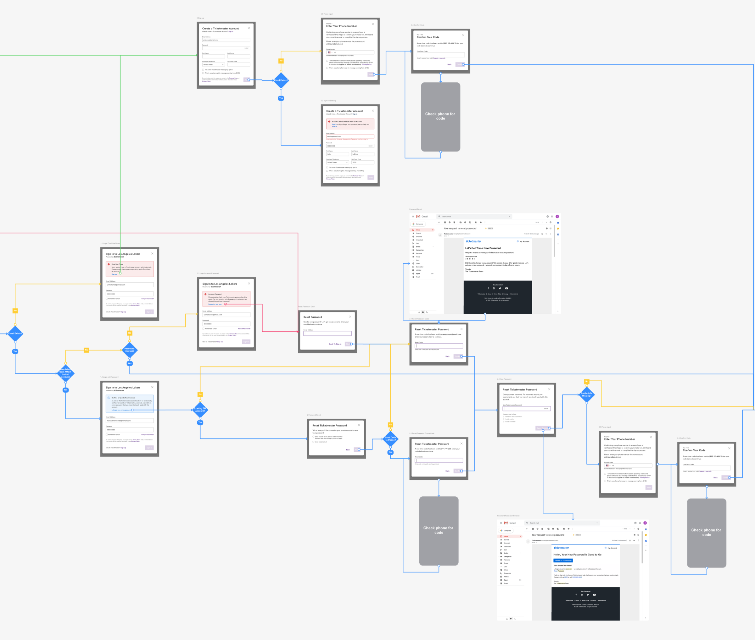
Flows were made of the entire ecosystem and all use cases to give us a sense of what screens needed to be designed. We then designed screens that would allow the least amount of steps and user input necessary. Finally, we worked with our partners to craft messaging to educate fans beforehand, along with a roll out strategy.
In the end, millions of accounts were effortlessly linked, allowing season ticket holders to more seamlessly manage and access their tickets.

Virtual Venue
Virtual Venue is a Ticketmaster acquisition that allows fans to see photo realistic renders of stadiums, event centers, and theatres, along with a 360-degree view from any seat in the house. My first project at Ticketmaster was to integrate this technology into the Account Manager buy flow.
While the majority of Account Manager traffic is mobile, one section that is viewed over 85% on desktop is purchasing or upgrading season tickets. Fans that spend thousands of dollars on their favorite team want to see the view from their selected seats, along with amenities and perks.
Because the majority of screen real estate is taken up by the stadium renders, our traditional design components had to be completely reconsidered. Ticketmaster brand colors needed to take a back seat to not clash with team colors. A more neutral, video game inspired set of components was created.
During the research phase we learned that fans purchasing tickets often wanted to see what ticket prices are in comparable sections. To allow for a quick, integrated comparison, we incorporated the ability to see ticket prices in the 360-degree view, linking to that section for details. In addition, fans can also add up to three sections for comparison in a more traditional table view.
After the Virtual Venue integration, average season ticket transaction prices went up 4%.
Reimagining Checkout
In 2019 Ticketmaster and Paypal launched a new partnership to let fans purchase tickets using Paypal and Paypal Credit. We used integrating this partnership as an opportunity to redesign the checkout experience. The previous incarnation used a multi-step accordion interaction that required a user to complete each section before proceeding to the next. This process was slow, required too many clicks, and didn’t allow for an overview of all checkout options.
For the redesign we wanted to streamline this process and allow fans that had previously purchased tickets to be able to purchase with a single click. A one-page design provided a better understanding of all required steps at a glance. Options that were previously hidden behind dropdowns were moved to radio buttons to expose all available choices.
In trial tests the average checkout time went from 4:03 to 3:10 minutes, saving a potential 1,312 days per year across all checkouts.
Previous Design

New Design
