Urban Influence
- Art_Direction
- FrontEnd_Architecture
- UX_Design
Urban Influence, a branding and interactive firm located in Seattle, was in need of a portfolio update to showcase our latest digital endeavors. The new site needed to be standardized enough to easily update via a CMS, while flexible enough to handle different Case Study layouts.
Seeking to make everything as responsive and extendible as possible, we quit thinking about Photoshop mockups and instead opted to design the main framework in code. This freed us from making multiple mockups per page for different viewport sizes, thereby greatly decreasing design time.
Visit the SiteLooking Good at Any Size
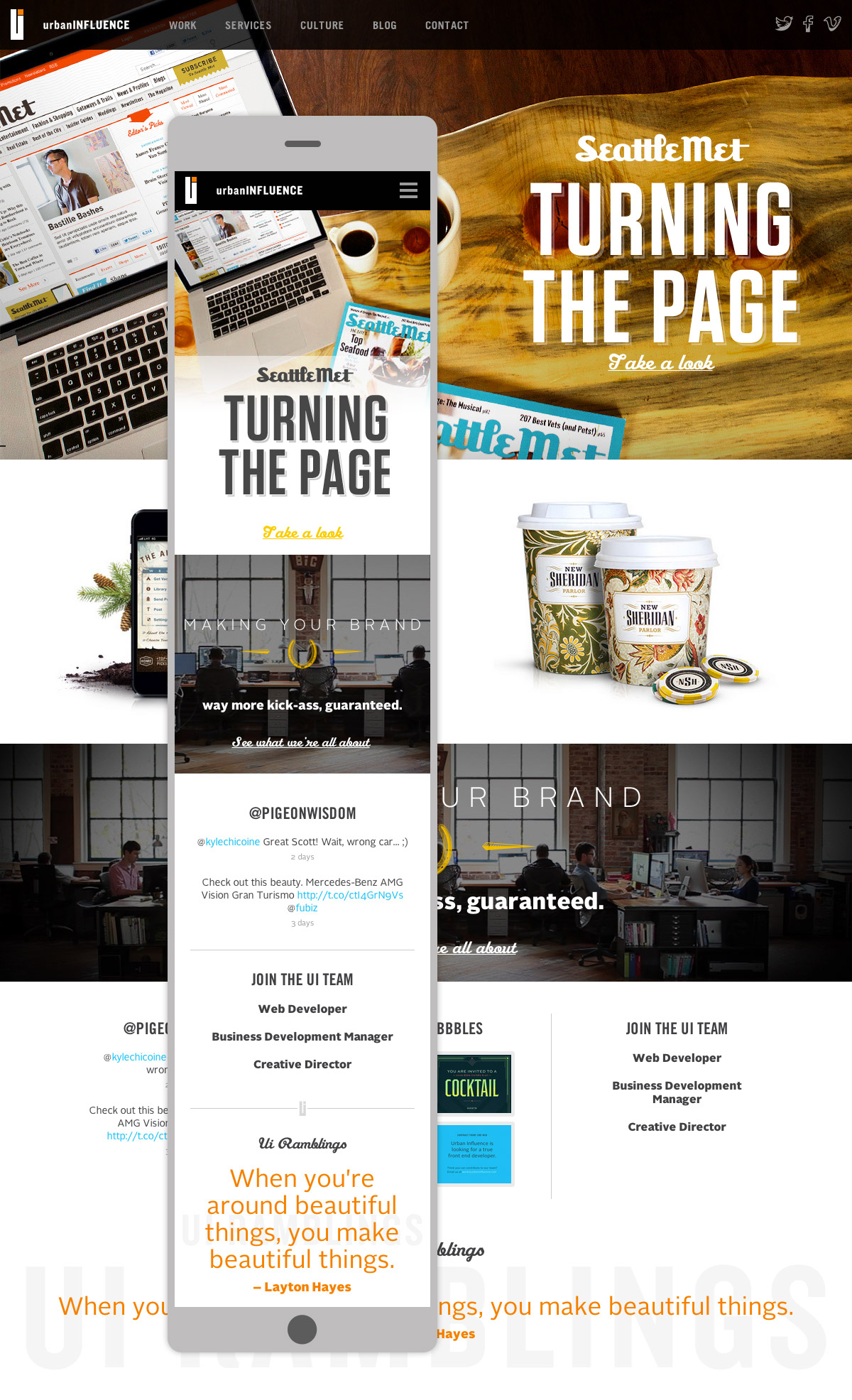
When we started designing a site to showcase our personality, work, and culture, Responsive Design was a term rarely used or thrown around. Creating our own large scale Responsive site would be the perfect testbed for future projects.
We spent a great deal of time setting up a flexible grid that would be used site-wide, choreographing how things reflowed across multiple viewport sizes to provide a seamless experience.
Built for Content Scalability
One of the problems that plagued the previous site was difficulty in updating and adding content. Updates needed to be coded in HTML via a rudimentary CMS, leaving only developers to make changes to the site.
With developers' time in short supply, all employees needed to be able to add content. This was achieved by building a flexible grid on top of a custom Drupal framework.